Thursday 30 October 2008

Quote of the year!

''Starchy foods are bad for your shit system.''
Dawn, (2008)

Sunday 26 October 2008

Kay, so here we are once again.. falling behind with the ol' blog. I'll try to update. So, this week's been a bit of a blur. Fast moving! :O Another week long project... 'What is violet?' Basically, my concept was, 'Violet is luxury'. I focused on dairy milk 'cause the wrapper's pu...VIOLET. I also though, what else means luxury?? Ooh, a fur coat! So I more or less put the two together!! Clever no?

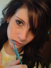
Geez. I hope she doesn't mind me putting this on here. I thought I'd put at least one up. One of her not looking so naked as she actually was. But you get the drift? I really wanted to make it look as good as I could, considering the pictures I took were done in Liberty living room of flat 421! I think they came out really well. £60 well spent I'd say! Heh. Even though they all got splattered in melted chocolate. :/ I've officially stained my mattress protector. HA!


A sneak preview of le book in progress. A page I quite like. I'm still needing to do more, but I'm out of ideas!? Inspire me!??!?!?!???
But yeah, the project's now over.
I don't think I'll re do this one. I quite like how it is now. The photoshoot wouldn't be as easy to re-do due to ruined garments *sigh* But I'll definitely take what's been said about my work and use it to develop my future outcomes.

Sunday 19 October 2008

Better late than never!

Yeah, so as the title says: Better late than never.. I'm referring to print sessions! Eek!
The first day of print was wicked, although it got really quite boring and knackering by the end of it. :/ We did the same thing allllll day, but I did get some cool things out of it! Yaaay! I'm really pleased with the outcomes!!!! Like I said, I started to get a bit bored near the end of the session, so I decided to smudge the piece of plastic we worked on in the inks randomly. None of the marks were intentional. I just wanted to see what would happen. And funnily enough, it's the image below on the left! Looks pretty nifty wouldn't you say!? Well I like it! :D I'm really happy with all of them I'd say. It took me a while deciding which ones to put up here! But here we are. :) Enjoy!!


.....I kinda wish I put print down as my elective now. Hmpf....

Screen printing.
This was a cool technique we used. We picked one of the prints we made and then photocopied it. We then made more marks on it, changing it as much as possible using tippex and a black fine liner. We then photocopied it again, then exposed it onto a screen using the big scary vaccume machine type thing. After about 5 minutes of exposing.. we were ready to print! :)
It took a little time making sure everything was in it's correct place and neatly fixed in the metal bed thing, then we could start le mess!
First, we applied a cyan. Then, once it had dried, magenta. These are the outcomes.


Friday 17 October 2008

All done!

My project's complete! :D Well, it'll get re-done, but I've done it! Yaaaaaaaaaaaaay!
Here's the final outcome..


Looks a bit pants, but that's only 'cause it was on the pooey wall with tac behind it!! No one bothers to take it off. HMPF TO YOU!
I'm really quite pleased with it to be honest. Compared to
 the others I saw, mine's very simple, so I couldn't stop thinking it was boring and poo. But I really think it illustrates the words I had well. And the more I look at it, the more I like it. :)
I scanned it into illustrator, and properly aligned the letters up which looks awesome!! Here's the illustrated version.
I'm really happy with the outcome! :) I found some letters reeeeeally hard to do, 'cause I'm such a perfectionist. But hey, I guess that's a good thing!? 
I wanted to make sure the letters looked as though they belong for sure. I wanted them to look as similar as possible. So for each one, I used a similar shapes from another letter. If that makes sense?? That's how I was taught at college anyhow! I find it works for me!
I loved this project though. I really got into it. And I'd happily do another one!

Wednesday 15 October 2008

Alphabet Soup continued...

I have a day to finish this damn thing. Soooo, I thought I'd better get a few pictures up of what I've been doing with my time! Just to prove I haven't been sitting around on my arse like most people probably think.
This is what I done early on. (Please excuse the smudge) *sigh* I just hope it doesn't annoy you as much as it does me!
My project is Sam. Sam Reynolds.
Most of the words I wrote down in comparison to his were quite the oposite. GRR. So, I thought, why not use this to my advantage!? So I've gone for the 'messy but neat' route. Here, you see mess. :) But really it's neat. It's a neat mess. Just agree with me, kay.
So yeah, here's another...
This was actually a mistake. Well, half of it was. Long story, don't ask. But yeah, it's the stuck down then wripped up affect, with newspaper. I just like it. Do you? Anyways, I'm nearly there now. I've more or less got my alphabet sorted. Just need to play with the positioning a bit more. THEN draw them onto tracing paper. Waah!

Tuesday 14 October 2008

Alphabet Soup


Well, still doing the alphabet soupy thing!! TRYING to do this damn thing, but the ideas just aren't flowing. Hmpf.
In Critical Studies at the moo. He's going through like, the third powerpoint presentation. BAH! I thought I'd have a browse on here for some cool things. I need to keep upto date with uploading and stuff!! I must say, I'm struggling to get into this whole blog thing!!
Here's what I found!!
HOW COOL IS THIS!? I just love it. It HAD to be on here.
I've always found type interesting. Whenever I've had a type project, I've usually linked it with people and faces etc. This is just pure genious. Love it love it love it!!!

I'm really into simplicity. I'm not a fan of over working things. I need my space.
This is a really nice piece of work. I like the use of colours.


Monday 13 October 2008

Playing with purple

Righto. So we were all given a colour.... I was given the colour purple!
We were told to bring in around 10 items each which matched our colour. It sounded pretty simple at the time. Until we got into college and was told to categorize the tones!! Grrrrr!! It took a bit of debating between the purple group, but we got there. :) We were also told to present the objects in different ways. We chose a cool way.. Basically we made one huge line taking up like, 5 tables! Haa!! Was awesome!! We ended up making a cross-like shape, because of how the colour turns into others. For example, blue. Or red.
Here's a few pics I had to steal (Chloe- the only person who had them on her blog. Well done!) 'cause I didn't have a proper camera at the time. I did however, have my phone which allowed me to take like, 3 or 4 pictures.

So after all the commotion with categorizing, we had to take visually interesting pictures using purples complimentary colour, yellow! Again, here's another picture I nabbed to try and keep up to date.

Great quality for a camera phone picture eh! :D

Tuesday 7 October 2008

kandinsky's work

These are GORGEOUS!! Looked at a few in critical studies today. I think this must be the only thing I remembered.. eeerr... I has notes though. :)


Just look at that horse! No wonder I can't draw them! Where did I go wrong?

So little time.

Omg, I've actually got so much to do. I'm depressed. I'm a depressed busy person. With a HeAdAcHe. *sigh*
Times like these I wanna curl into a ball, bury myself in the duvet and sleeeep. Ooh, sleep. That's not a bad idea. .........


You see this -v
I should be in the middle of it.

The 10 type brief.

Right, well I know people are just dying to see MY work!
Here we go! :D


Man I SUCKED at this! HA!
I'm definitely gonna re-do these. I didn't actually know we could change the style for each letter, so that's why there's like, 3/4 of each. :/ So yeah, once they've been re-done, we'll compare!
AAAAAAAH!!!!