Sunday 29 March 2009

Resolutions!!

So here's my final piece!!.. an alphabet poster! Bit of a cop - out, but considering I didn't work upto a final piece, I reckon it's pretty good.
I stuck with the whole connection business, and as you can see, made sure the letters were all joined. I wouldn't call myself a strong drawer, so I tend to make them very sketchy and rough. I found drawing with the left hand helps, and makes them look quite cool. So I decided to use that technique to write the alphabet.
All three will be printed at a scale of A3.


That website we were told to look at!

www.ilovetypography.com


''I remember clearly the day I was waiting for the 6 train at 33rd Street and Park Avenue in New York. I had taken pictures of type on the street for some time, but there was something here that caught my eye. There was a plastic sign on a door with letters and numbers routed out of plastic, and I noticed a couple of characters in particular: the way the 8 curved back into itself, the charming tail of the a. And then I realized that the lowercase e’s were all different. This had been done by hand and therefore wasn’t an existing typeface. I knew then that I could actually make this into a font.''
Even though it's been said (above quote), this is actually a really nice example of typography. It's interesting to see that even though it looks well formed and well done, the writing has actually been done by hand. If I saw this on the street, I probably wouldn't have noticed the differences between the letters.

There's this awesome game on there!! I guess if you play it enough times, you'll really get familly with the types of fonts!! It's actually really good haha!! This is the website.. http://www.deep.co.uk/games/font_game/

Wednesday 25 March 2009

Partner work..

Ok, so I haven't actually created any posts for this yet.. OOPS! I'll have to make up for it now I guess.
Rewinding right to the beginning of all this malarky.. we all had to fill in this form...

(SCANNED FORM)

One side was about ourselves, the other about what qualities we wanted in our perfect creative partner. Then, we had to make 2 posters. One promoting ourselves, the other stating what we wanted in a partner. 
After many hours of reading others posters, we had to choose which one appealed to us most, and ask them to be our partner. I can't believe I did it.. but I did.. I approached the Townend, and to my surprise.. HE ACCEPTED! :D Yaay!!
THEN.. we had to fill in ANOTHER form, after deciding which statement we wanted to concentrate on. (We chose 'Get people to talk to communicate more', by the way!) We had to write why we chose it, and how we'd each put our skills into practice whilst completing this task. 
We more or less went our own ways to get our own research, and to think up ideas for the concept. We used the rest of that Monday, and the Tuesday and Wednesday purely for research and idea generation. Thursday, we got together and discussed our preferred ideas. It was a really good day!! We worked really well together, and both put loads of effort into it. I must admit, I did have my doubts at the beginning, but working with Adam was really nice. He may come across quiet, but he certainly knows what he's doing!! :P 
Anyway, we came up with a new concept, but we made sure it related back to the original one, and then started thinking of possible outcomes. We more or less decided posters would be the most appropriate idea, so we stuck with that. 
THE BIG IDEA!!
The older generation generally looks at teenagers/younger peo
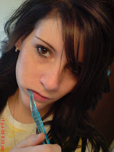
ple as trouble makers. They think they're always getting up to no good, and they do nothing nice in the community. It was kind of based on appearance of youths of today. This is what we wanted to change.  People judge others before they know them, and so we wanted to photograph stereotypes; i.e. goths, chavs, emos, skaters etc.. and attach a news story to each, describing a ''heroic'' story about them. I was in charge of photography, and so I approached a few people who seemed unapproachable, and asked to take their photo. They turned out to be really nice!!! I was sat in front of them for a while, debating whether or not to talk to them, and now I'm really glad I did!! It just goes to show, appearance shouldn't have any effect as to whether you talk to someone you don't know. 
Anyways, I got around 8/9 people from which I took lots of photos of. I brought the pictures into college, and after a VERY long while trying to decide which 4, yes 4!! to use. We then came up with a few layout ideas, and Adam put full effort into using Illustrator to put the bits and pieces together. 
Here are our final outcomes! :)


We also had to put them in context...

A bus stop...

..and an advertising stand outside an off license.


Rob Ryan

It was reccommended to me that I take a look at a book called 'This is for you' by Rob Ryan. It's a book with very sweet illustrations and type which are amalgamated in a very rough kinda way. It's got so much character and is really interesting to look at.
Here's a few of the pages (from the net of course)


Tuesday 24 March 2009

Nigel Palmer

Here's some work by Nigel Palmer, a tattooist in Brighton. He actually tattooed Boysie's arm!! But yeah.. his work's really cool!! It kinda relates to mine, so I want mine to look. I've been drawing more with my left hand, to get the squiggly lines, and I know that's definitely the way I want my piece to look.
I'm still not sure what I'm going to be using. I know I'll be using type, for sure! Imagery's debatable. It needs to relate to the type style. We'll see eh!


What I've been doing..

So, here's what I've been upto!!! These are some of my favourite design sheets! :)
Starting from the beginning, these are my inital responses. Because 'what is a line?' is so broad, I decided to narrow it down. I more or less did a design sheet for 'lines in images', 'lines in type', 'lines in patterns' and 'lines in animation'. From them, I more or less had a pathway of interest, so I researched more into animations. I created some of my own stop animations, which I uploaded a while back. They're nothing special considering I'd never done it before!

So anyways, here we are, my toilet man!

Patterns.

I actually quite like this drawing. I've never been confident in my drawings, but using watercolour pencils it quite an interesting way of working.

Here's another of my drawings. I used to draw flowers quite a lot. I find them fascinating. :)

After talking about my work, it was brought to my attention that I should use type within image. So here, I've used type to create an image. In this particular case, I've used the definition I chose of 'line'.
A mark indicating position, connection or boundaries.'

And another drawing using type. This time, I've used words which relate to the actual item. On the stem, I've used the word 'stem'. The same for the leaves, I used the word 'leaf'.

This shows where my work has gone.
I had some wodden letters which I stuck close together. This made me decide to focus mainly on type, rather than try and fit it in with imagery.

So I started with the basic, just playing with type. Using my own handwriting I chose to write the definition I've been focusing on using only one one. I think this works rather well. It looks quite interesting. :)

I began thinking of other medias I could use to write, without using pen or pencil. So, I rummaged (can't spell it!) round to see what other materials I had. I threw some shoes out the other day, and just so happened to keep the shoe laces! So they came in handy. Also, one of the obvious ones was string. So yeah, did that too. I think the string has a nice effect, although I'm not too excited by using it!

This is the shoe lace attempt..


I also used white paint above the A2 paper to write my definition.
'a mark indicating connection'
I tried it a few times, but on a reddish coloured paper. I think that looks a lot better than this grey.
I really like the effect the paint makes, even though the words aren't very legible. (On the others they aren't anyways!!)
I think I could carry on using this technique, although I don't have any other coloured paint- not drippy enough anyways!!
I didn't realise we actually had to finish this breif with a final outcome!

So I haven't exactly been working towards making one, which sucks, 'cause now there's only a week and a day left! Keep scrolling..

I started playing with the alphabet. I thought perhaps this could be included in a final outcome?? Like I said, I'm not prepared AT ALL to have a resolution. I thought it was based on research!!! So yeah, a possible typeface?
I really like the way in which this looks. I started off using my normal writing hand, but then attempted with my left! I used my left hand for some of the drawings too, which was earlier on in my work. I think it gives the work more of a character. It's as if it's aloud to be messy. Whereas with a normal writing hand, it's expected to be neat and perfect! Screw that!!!!!

Monday 23 March 2009

Icons and pictograms!

I appreciate the fact that I haven't actually uploaded or mentioned anything to do with the icons and pictograms work in visual language, but I will put up my finals. 
I can say honestly, this wasn't my cup of tea! I found it really hard for some reason, although I did try, and I now have two final sets of routines. So I must be doing something right???
Here's the first routine. See if you can guess what they mean!? The answers will be at the end. :)


Ok, so that was the first routine!! Yeeeeaaay! 
Now to see if you guessed them correctly!!..
They were.. wake up at 6am, have a shower, blow-dry hair, get dressed, do make-up, have breakfast, and brush teeth. 

Now for the next lot!


And there we have it. The second lot. :)
They were.. walk.. to Morrisons.. get a trolley, collect items, pay, call a taxi, get in the taxi, and return home. 

I think I prefer the first set, just because they work better visually. The visuals are much more interesting. I have to say, I struggled a lot more with the trip to Morrisons. But ah well, it's done now. :)

Sunday 22 March 2009

Presentation boards-communication

So we had to produce three A3 boards to present our idea to a small group of people. Honestly, I wasn't feeling it, but luckily Adam knew what we had to do!! He was such a great partner!! 

The first board: 

This was more or less showing our thought processes and how we worked our way onto various new concept ideas.

The second board:


This was based on the research and our findings. We thought it relevant to include the results from a survey which we had asked loooads of people to fill in. It was all about talking, to both strangers and friends. We also had a few example stories which we thought was also relevant, just to show what we were aiming for. We had found a photograph online which was how we wanted ours to look. We decided black and white photography would be best, as colour would probably have looked more like a fashion shoot, and would have drawn the attention away from the concept. We also wanted to capture some of the environment. Our idea was to photograph people in their ''normal'' (to them) environment. We thought this would add to the way in which people see others. 

The third board:

This board shows examples of layouts, and how we thought the imagery and text would fit together nicely. The four on the left were mine. I did a fair few, literally just playing with where things would go. The larger one on the right, Adam drew, and very nice too! This was the main one, we decided. The image would be on the left, with the story on the right. 
We also looked at a few typefaces. We thought, as the story would look as though it's been wripped out of a newspaper article, it would only be right to use a font close to the one used in the papers. We decided upon a Serif. 
The writing at the top just explains how many boards we'd be producing, who the target audience is, and what would be used on the posters.